Monday, 26 November 2012


Here i've applied the 3d compositing effect to the image below. I think it works reasonably well but there is not much movement amongst the further back layers. This makes it hard to realise that the houses in the background are all separate layers. I think i will keep doing tests with this image to try and make it better. 


Here i've just put jacks character design for Alistair Lloyd over the background i created. Everything is on separate layers which makes it easy to do the 3d compositing effect in after effects. I think this image works well. Now i just need to test animating it.

This is the background i created for the farmers scene. I'm less pleased with this one i don't think it works so well as the other backgrounds. So i will probably keep working on it. I think the effect doesn't work so well for the hills. Now i need to get jacks character designs and put them in these backgrounds and test animating them.


Here are some examples of original images that i used to create the background for the farmer scene.


This is the final background i composed for the gambler 'Alistair Lloyd'. Here i've taken 10 images, cut them and applied some affects then make them on seperate layers. I think its a successful test maybe not yet perfect but i think it looks good.

Here i've started working on the gambler scene. Like the previous prison scene i've taken lots of images, cut them up, edited them on photoshop and put them together to make a layered scene. the first two images are 2 examples of the original images that i used before i edited them. 

Sunday, 18 November 2012

 Prison scene


Here i've been working with Jack, taking photos and digitally editing them. I think this effect looks great, grey-scaleing the image, then taking out certain parts and applying a cut-out effect on them. It is very Guy Ritchie style as well. I've done a test of a prison scene above, by cutting up various images, putting them on different layers and then applying this effect to them. All that is left is just to add Jack's character designs. I think this prison scene test has been very successful. So now i will compose more of these scenes for other characters, try and apply Jacks characters to the scenes and do little test animations using the 3d compositing effect.
Here i've further developed the backgrounds digitally. Playing with different ways of presenting the objects and things in the different scenes. I think these tests work reasonably well but i don't think they will work with jack's character design style. His character designs are very realistic but also artistic, i think these backgrounds will be too simple or cartoonish. I think i need to start testing creating backgrounds by manipulating photographs, this will get that realistic look and work with the characters. The difficulty is editing the photography in an artistic way that will work well.  


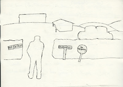
Here i've been doing a few basic drawings of how different scenes could look with background objects. I've tried a few different styles of how the scene behind the character could look. However these are just basic black and white drawings, i will go on to do further colour tests, computer editing and applying little animations to find out the best look for each scene. Jack will be in charge of creating the characters so i will look more into the backgrounds. 
This is a test for a more detailed look, we could potentially use this style in our final title sequence. Jack (who i'm working on this project with) created the image and i cut it up into layers and applied the animation. The difficult part was painting in the gaps in the layers after they'd been made separate because when, for example, the cards were cut and put into a separate layer there is a card shaped space in the background layer. This is the style we could work on, over the top of some of the scenes from the video below, for the final look.


Above is a basic animatic for a few scenes that i put together just introducing a few characters. The first part is just using the procedural crumble i learnt earlier. All i've done for the first shot in each scene is: cut the image up so that each object is in a different layer. Then i've used the 3d compositing technique that i learnt earlier, added a slow camera pan and it gives the illusion of 3d depth. Then for the second shot all i've done is a quick camera zoom and change to the second image. In some of these scenes i've kept the real names of places that are in the Archers radio show for example, 'Brookfield Farm' and "the Grey Gables'. This helps relate it more to the original Archers programme. 

Title Sequence Project


Firstly we thought, how are we going to introduce the characters? Our first idea was to have 2 shots for each character: The initial shot setting the scene. The 2nd shot will zoom to the character in the scene and the character will react to the camera, thus introducing him. So i drew out a few images for each character; heres an example below of David Archer who's a farmer. The first shot will slowly pan across a farm with a mystery figure standing there. Then the camera will suddenly zoom to the second shot (below) in which he turns to the camera as if we are trespassing. Above i've put together a basic, short animatic of a few of these scenes introducing a few different, shady characters.  
                 

The title sequence project: Our group is working on "The Archers Reloaded" which is a remake of the Archers (radio), for television, but directed by Guy Ritchie. The Archers is one of the most well known radio programmes ever, but particularly amongst younger people it's known for its dullness, the impression we get from it is its just a bunch of farmers chatting with no real problems. So we thought that it would be interesting and funny to do our own remake of it in a Guy Ritchie style, mainly thinking about title sequences of Rock n Rolla, Snatch, Lock Stock etc. known for being: stylish, 'cool' and rock n roll. Our project won't be made intending to be a comedy, but there will be comedy in the juxtaposition between peoples perception of the Archers and the much more high octane, action packed style in which this title sequence is portraying them. 
It turns out after a bit of research that a lot of the Archers characters have issues that are quite extreme. For example a few characters are drug users, another is in prison, another a child abuser, another an adulterer, another one is a gambler etc. We can emphasise these issues in our title sequence. Guy Ritchie usually uses the title sequence as way to introduce his characters and tell you a little about them. so this is what we want to try and achieve.

Saturday, 17 November 2012

 Final rendered shot that will be used.

 View of the mountains in the workspace.

 The view of the entire scene in the workspace.

 Rendered view of the entire scene.

View of all the vertices in the workspace.

Here is a mountain range which i modelled in maya for a friends 'Exeter Ident Project' about a skiing race. It was surprising simple for something that looks so realistic. I find that i'm getting to grips with a lot of features on Maya but there are still probably a lot of basic things that i don't know. In this piece of work i learnt a lot about texturing because i've never really done it too much before. I also found a lot of useful tools and features in maya, for example the soft select is really useful when moving around vertices etc. but also keeps the shape even, the ocean shader and height field features and i learnt a lot about manipulating planes and textures to perfect the final outcome. The only annoying thing is that my friend has asked me to try and make it a bit simpler, which might be tricky. 

Here is some work that I've done on after effects. I was just trying to learn a few basic techniques that i think would could come in useful for our title sequence project (that i will talk about in later posts). the top video is 3d_compositing, in which i took various 2d images moved them backwards and forwards in 3d space and then made a little camera move to give the illusion of 3d depth. The second video is very basic, just creating neon lights. The bottom video is a procedural_crumble, in which i get some text and edited cracks onto it, then blended it into a brick wall and applied a moving shatter affect across it. The text says The Archers Reloaded, which is the name of our title sequence project that will be talked about in later posts.